고정 헤더 영역
상세 컨텐츠
본문 제목
[Tableau 시각화 스터디] WOW 2022 Week 39: Where were COVID-19 Cases most active on December 30th, 2021?
본문
구현해야 할 Tableau 결과물:

요구사항
- Dashboard Size: 1000px by 800px -> 사이즈 1000*800 픽셀
- 1 of Sheet -> 시트 하나
- Use Point, Clat10, Clon10, and metrics.caseDensity to create points for the map. -> 지도상에 포인트 만들기 위해 Point, Clat10, Clon10, and metrics.caseDensity 사용
- Make the pyramids. 2 longitude units wide.-> 피라미드 조건 1 (경도별로 0.2 unit)
- Make the pyramid height to be 1/60 of a latitude unit for every case per 100,000 residents. -> 피라미드 조건 2 (100,000 사람별로 한 케이스 생길 때마다 피라미드 높이는 1/60 위도씩 증가하는 것)
- Order the pyramids so the lowest latitudes sit on top of the marks with higher latitudes -> 피라미드 조건 3 (낮은 위도가 높은 위도 위로 오도록)
- Set the colour using case density. Set the start at 0, the middle at 75, and the end at 200. Use the Red-Gold color palette. -> 색 조건 (0/75/200으로 설정, red-gold colour 팔레트 지정)
- Match the formatting (map, marks, tooltips) -> 포맷 조건 밑줄친 부분들이 만들 때, 아닌 부분들은 다 만들고 포맷 설정할 때
필요한 파일 다운로드:
#WOW2022 - Week 39 Where where were COVID-19 Cases most active on December 30th, 2021_.twbx
0.22MB
그리고 Countries 불러오기

Step 1 ; EDA
County double click하면, 아래와 같이 각 county가 point로 보이는 것을 확인할 수 있음.


마우스 우클릭 후, duplicate as crosstab 하여서 두 번째 tab을 생성하고, 그 두 번째 tab에서는 두 개의 county만 선택해서 각 county 가 어떻게 구조를 갖는지 알아볼 것.
1) 아무 county 2개 클릭하고 keep selected only 2) point의 dimension 이동 3) point를 row로 하고, 4) metrics.caseDensity를 text 위로 올리면, 다음과 같은 화면이 보여야 한다.

데이터 상으로 이미 날짜는 filtering 되어 있는 것으로 보이고, 100,000명당 코로나 케이스 숫자가 county에 맞춰져 있음을 확인할 수 있다. (같은 카운티 내에서는 동일한 수치)
Step 2; polygon preprocessing
피라미드를 만들기 위해서는 (삼각형) 3점만 필요하다. 이를 위해, 1) data source filter edit을 켜서,
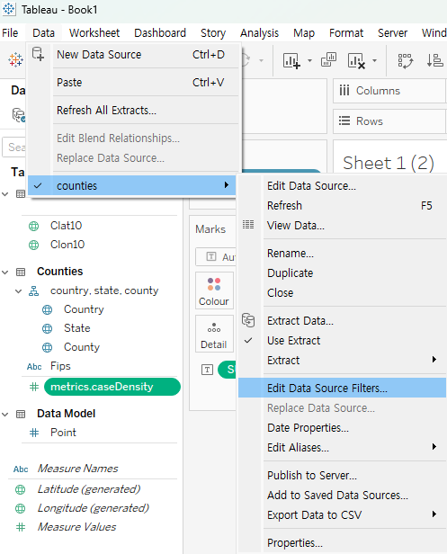
2) point를 누르고,

3) 1,2,3만 선택할 것

모두 완료하면, 아까 1
10까지 나오던 것이 각 카운티별로 1
3까지 나오는 것으로 확인할 수 있다.

4) Sheet 1(2)의 필터를 selected worksheet에도 적용해주고,

5) 삼각형을 만들 준비를 시작합니다.
longitude의 경우엔,
Longitude for triangle
| CASE [Point] when 1 then [Clon10] - 0.1 when 2 then [Clon10] when 3 then [Clon10] + 0.1 END |
이러면 "Make the pyramids. 2 longitude units wide." 조건을 만족시킬 수 있게 된다.

latitude의 경우엔,
Latitude for triangle
| CASE [Point] when 1 then [Clat10] when 2 then [Clat10] + ([metrics.caseDensity]/60) when 3 then [Clat10] END |
이러면, "Make the pyramid height to be 1/60 of a latitude unit for every case per 100,000 residents." 조건을 만족시키도록 한다.
이때, sheet 추가해서, rows에 county 두고, filters에 metrics.caseDensity 두면, 15개의 county가 null value가 있음을 확인할 수 있음

(NULL Value 있는 county는 drop 한 것으로 보임)
6) 이후, Marks 부분에 있는 요소들 다 삭제하고, column과 row에 있던 것도 삭제한다.
7) Latitude / longitude for triangle의 geographic role을 none에서, 각각에 해당하는 성질로 변환시켜 준다.
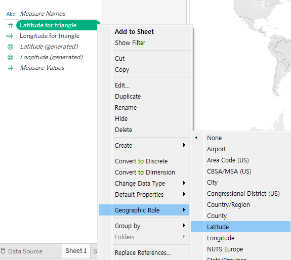
그리고 각각을 클릭하여 column, rows로 가게 만들고,
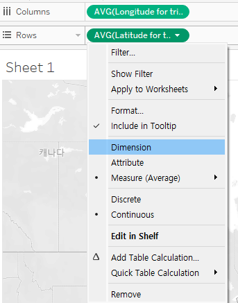
위와 같이 average에서 dimension으로 변환시켜 준다.
8) point를 marks로 넣어주고 나면, 다음과 같은 화면이 나와야 한다 (점 세 개)

9) Automatic으로 되어있던 것을 polygon으로 바꾸고, point를 path로 바꿔주고, county를 detail에 넣어주면,


이런 그림이 나와야 함.
STEP 3: 주어진 자료와 동일하게 만드는 과정 (기타 필터링)

1) 주어진 자료에는 알래스카와 하와이가 없기 때문에, 이를 제외시켜야 한다.

exclude 클릭하고, AL과 HI 찾고 클릭하고 OK 하면 두 state는 빠지게 된다.
2) metrics.caseDensity를 colour 위에 둬서 색을 넣어야 한다.
이때 순서, advanced 눌러서 start, end, centre 색 지정해 두고, colour palette 바꿔야 함!! (순서 바꾸면 안 됨..)


3) 다음과 같은 조건을 만족시키기 위해서, Order the pyramids so the lowest latitudes sit on top of the marks with higher latitudes,

county sort를 해준다. 후에, sort by field, ascending을 하면 원하는 조건대로 만들 수 있다.


4) 필요하지 않은 것들을 tool tips에서 빼준다

longitude for triangle / latitude for triangle / point를 tooltip에 포함설정 해제를 해주고, country data는 필요하지 않으니 그냥 빼버려도 무방하다.
5) 마우스 우클릭 후, background layer를 눌러 base, land cover, country/region name이랑 state/province name를 없애고, coastline은 추가시켜 준다.
STEP 4: dashboard에서 포맷 만들어준다.
Sheet 1을 끌어오고, 색 부분 삭제, hide title, (우클릭 후 format 눌러서) 경계선 삭제


pane - none 설정
제목도 설정해 줌 text - #WOW2022 - Week 39: Where where were COVID-19 Cases most active on December 30th, 2021?
tableau 글씨체 - 12 정도 - 왼쪽 정렬
https://public.tableau.com/shared/3445CQ6ZZ?:display_count=n&:origin=viz_share_link


댓글 영역